


In this space of Lazy Blog that we have called ‘The Type Corner,’ I want to try to introduce you to some new fonts and emerging foundries that are taking the market by storm, and which I hope will prove useful for your future projects.
Alberto Perera — 21 march 2024

It’s been a while since we last spoke, but we are finally back with some new updates.
Over the past few months, I’ve had the chance to explore and try out some new fonts that have impressed me with their quality and originality.
Today, I want to share with you five typefaces that I’ve tested and find interesting.
So, without further ado, let’s dive right into these new options, which will surely provide some useful inspiration for your projects.

1. Haltung

Haltung is a brand new grotesk designed by Joe Moore and released by Order Type Foundry, a foundry associated with the beautiful studio Order. It is born from the combination of two important typefaces, Röntgen Therapie by Walter Käch and Univers by Adrian Frutiger. The name Haltung comes from a phrase by designer Helmut Schmidt: Gestaltung ist Haltung (Design is attitude). It’s definitely one to add to your sans-serif list, give it a try!
2. Record Disc

After two years of hard work, the studio Image Format reintroduces the font Record Disc at Sharp Type, a sans-serif that brings the futuristic aesthetic of the ’80s into the contemporary world. Along with the Disc, they have also released the Laser version, which is even more futuristic in its shapes.
3. LL Ruder Plakat
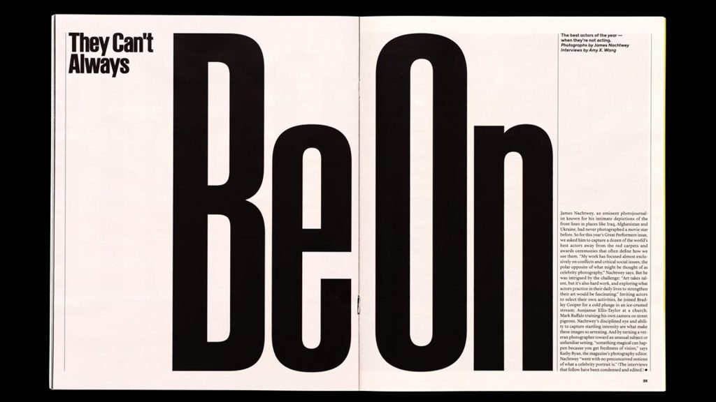
Let’s return to the Swiss world of the first font I mentioned. LL Ruder Plakat, designed by Hans-Christian Pulver, Arve Båtevik, and Anatole Couteau, and released by Lineto, is inspired by the posters designed by Emil Ruder, a key figure of the Basel School in the ’50s. Ruder used the Ruder-Schrift font, a variant of Azdient Grotesk Condensed. If you’re interested, you can find the full story to read here.
4. AM Serie 704

Stefano Baldassari, designer at CAST, designed this beautiful font, refined thanks to the research work by Luca Lattuga on modernist alphabets. The Serie 704 was released by Xilografia Milanese with a printed specimen from the late ’30s. Be sure to also check out the other modernist typefaces available on the website!
5. Melun

Lift Type has released Melun, a charming geometric sans-serif that winks at old video games. Romain Oudin was inspired by Rudolf Koch’s Kabel, as well as Avant Garde Grotesk and Futura, blending them with his own retro style. A beautiful piece of work.
And that’s all for this second installment. I’ll leave you to play around with these new fonts, see you next time!
Alberto Perera is a graphic designer and content creator who explores topics related to the world of design. Through his Instagram profile named «alberto.redko», Alberto share contents related to publishing and to the graphic design universe, recommending books and authors, telling anecdotes about the great voices of world design, and reconstructing the history of logos and brands we all know.