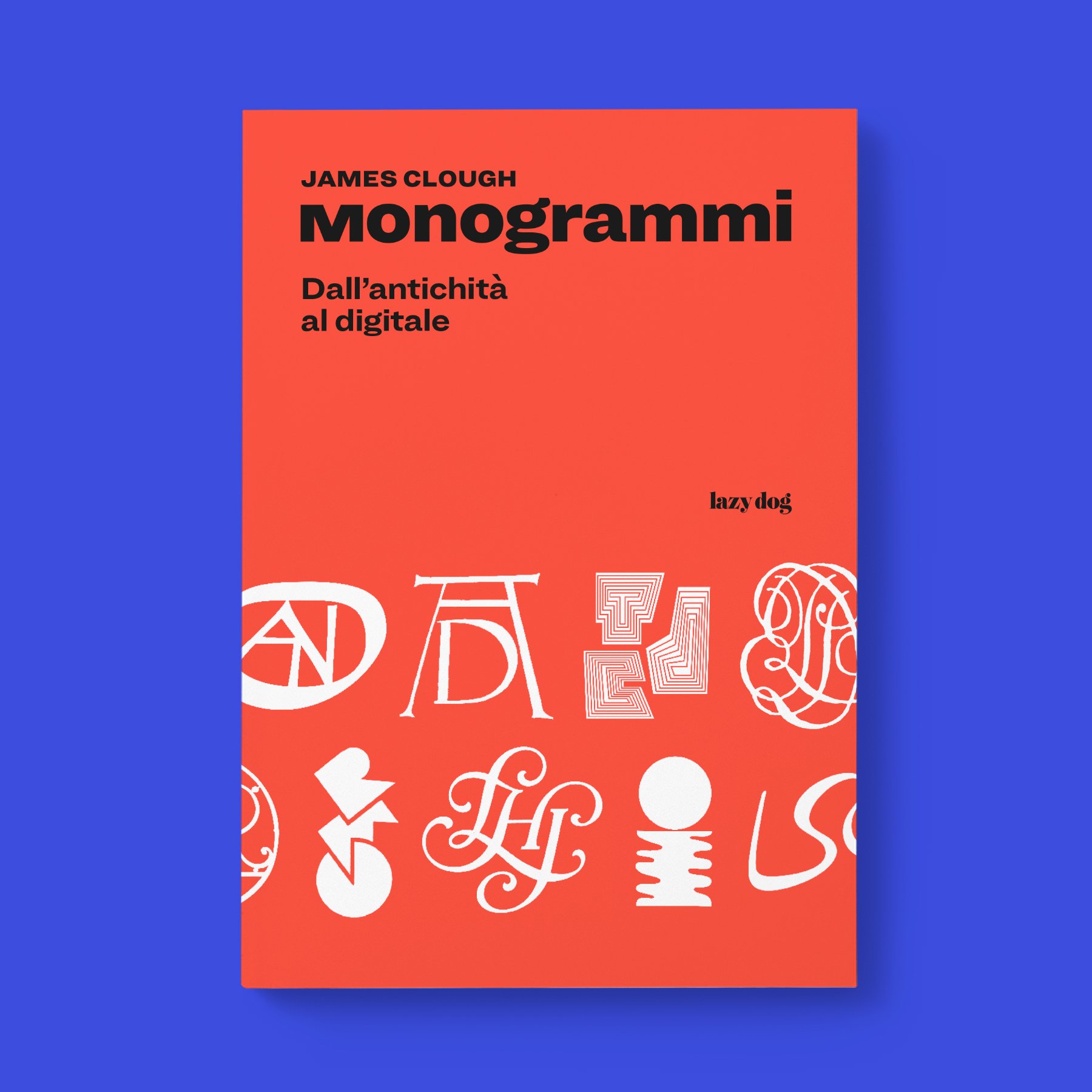
Monogrammi

Author:
Language:
-5% Off

Original price was: € 28,00.Current price is: € 26,50.

The book is available to pre-order and will ship from 15 October 2026.

The book has been realized in collaboration with Fabrizio Falcone.

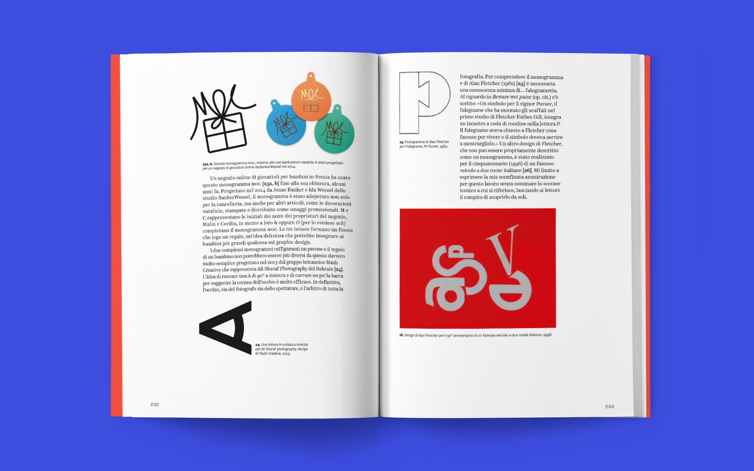
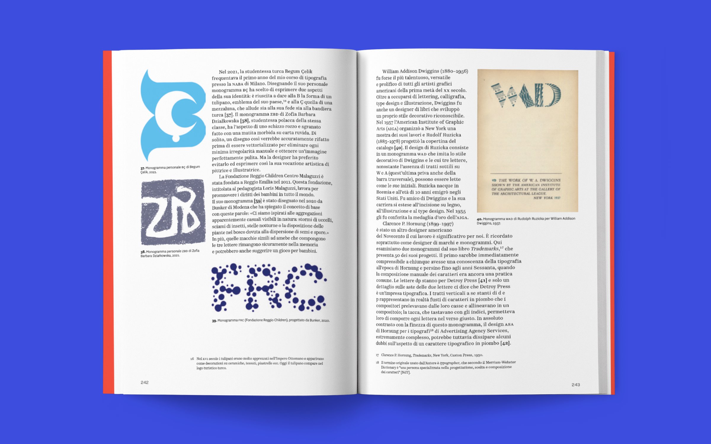
Monograms, the most elementary of letter combinations, paradoxically offer great opportunities for expressive creativity. Just two well-drawn letters can have more appeal and communicative power than a logotype made up of six.

Legibility is sometimes replaced by a visual puzzle: the image created by the letters is so compelling that the viewer accepts the challenge of deciphering them, and is “rewarded” with the satisfaction of having solved an enigma. This balance between complexity and seduction runs through almost two and a half thousand years of history and distinguishes the monogram from the logo, a marketing tool that emerged only at the end of the nineteenth century.

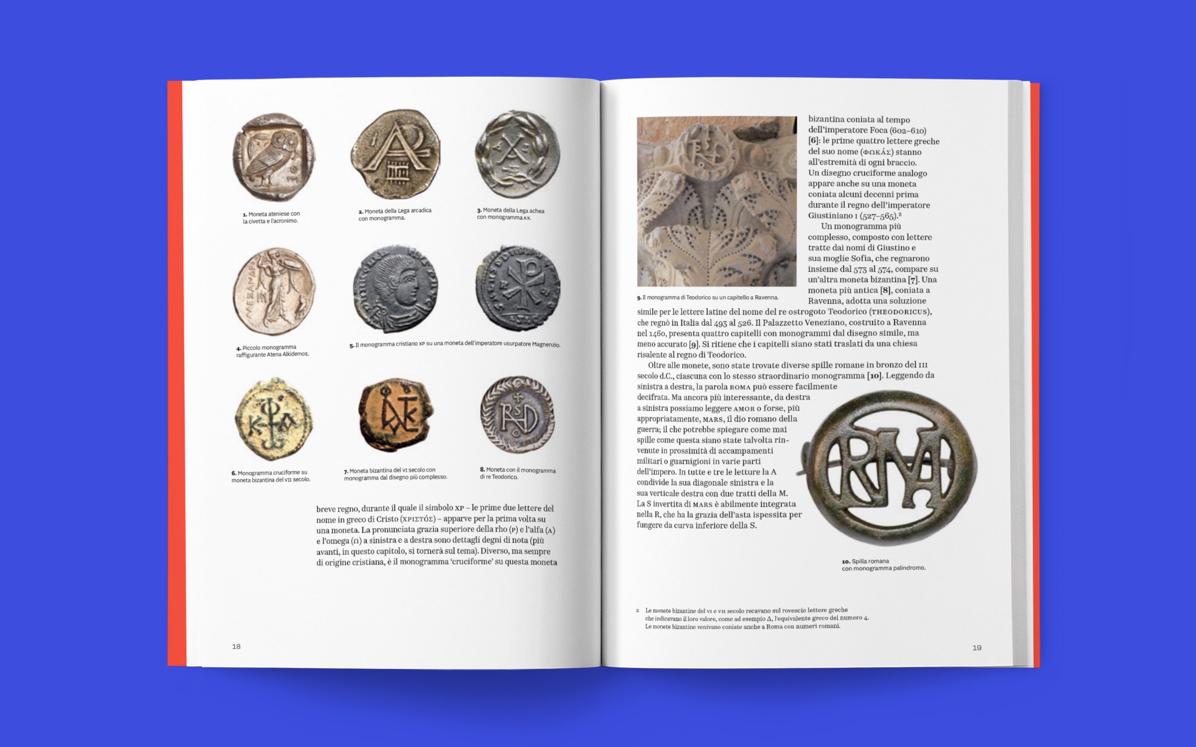
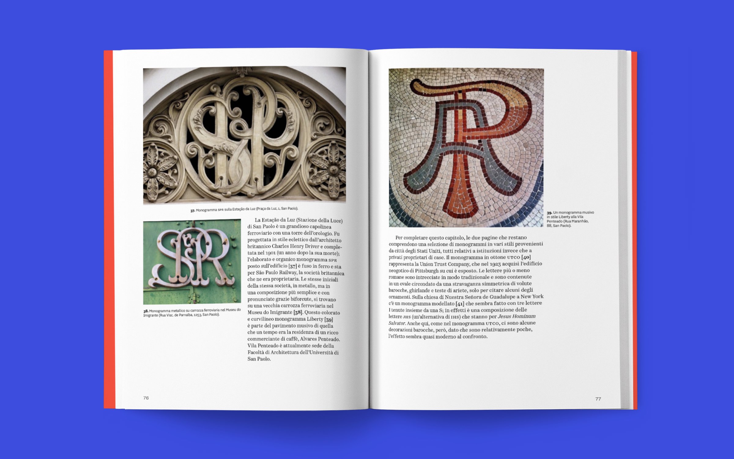
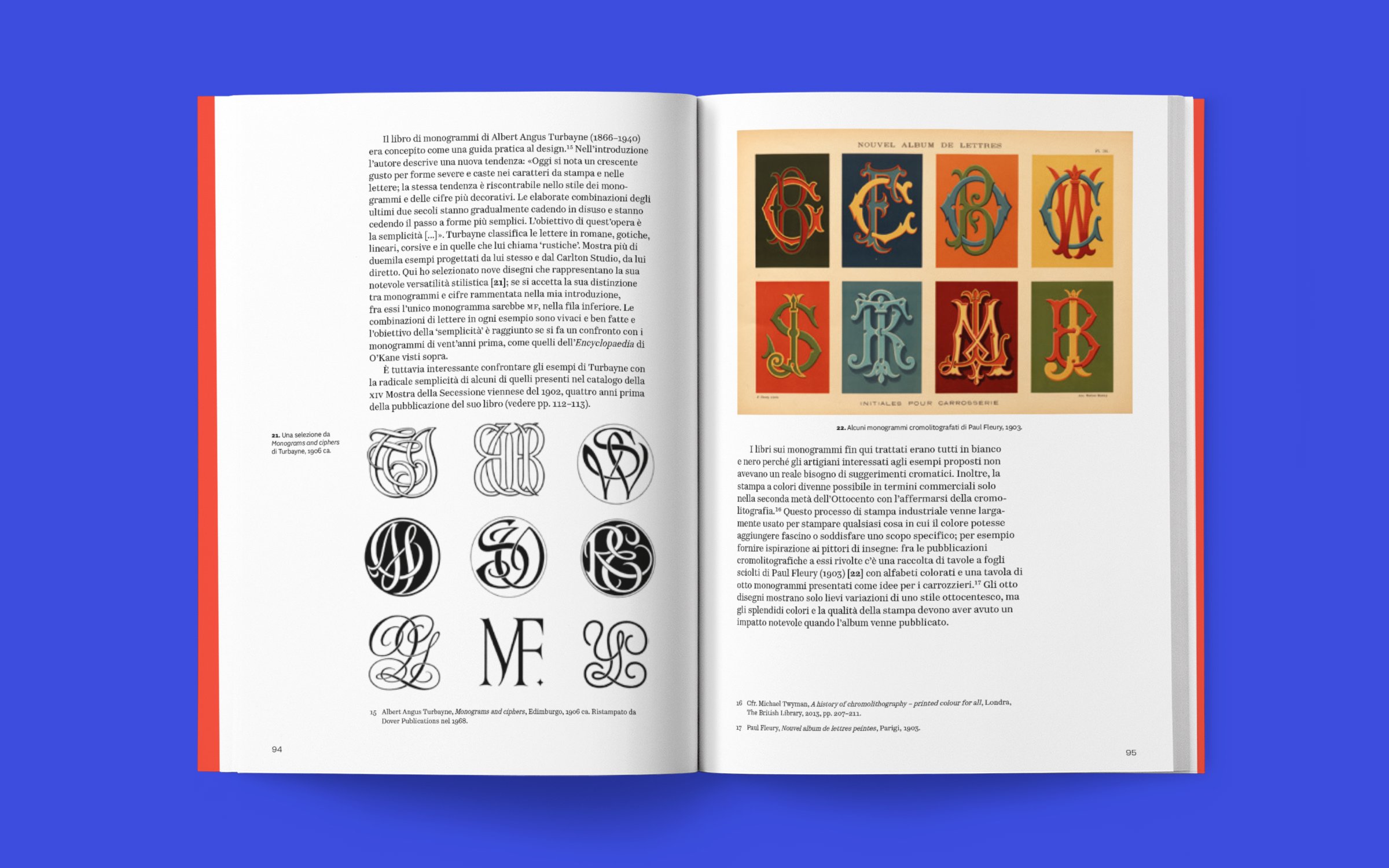
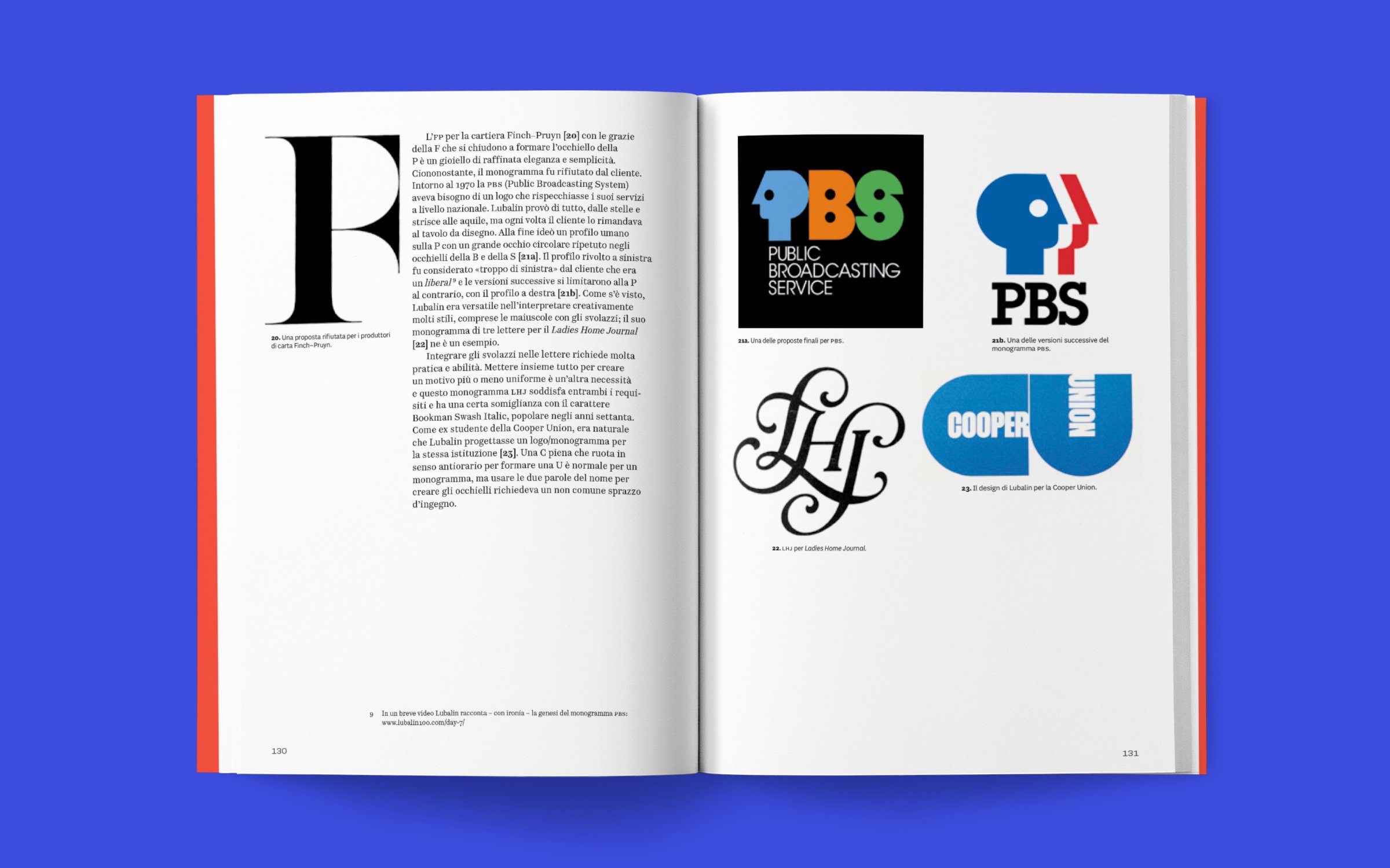
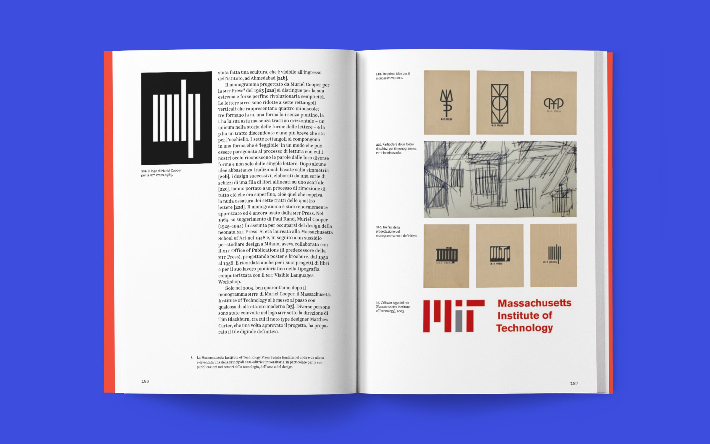
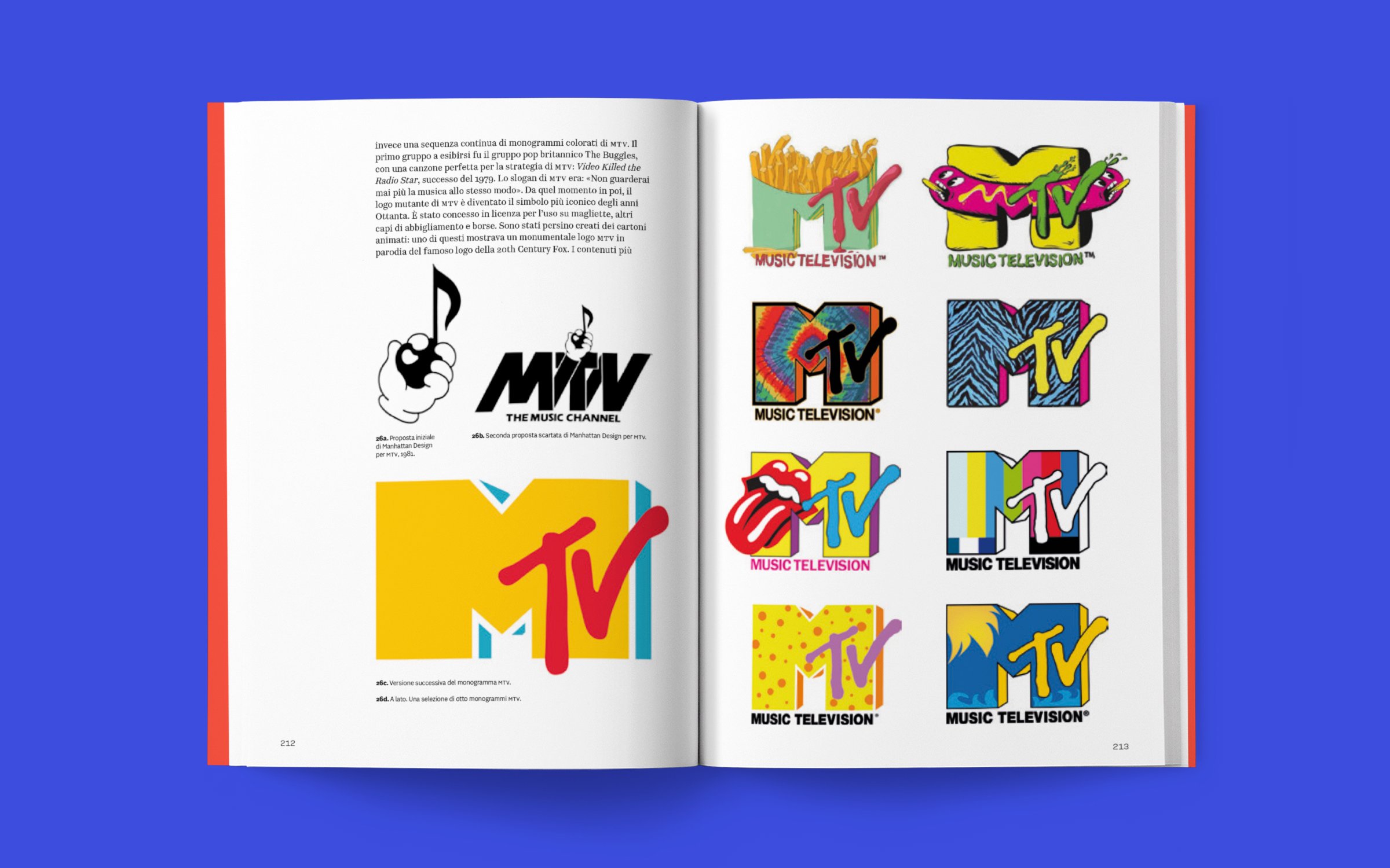
The book traces the history, design and applications of monograms over more than two millennia: from ancient Greek coins to medieval and Renaissance documents, from architecture to embroidery, and on to contemporary graphics and animated monograms. The first part of the book investigates the historical developments from ancient Greece to the modernism of the 1930s; the second examines five very different genres from the Second World War to 2024, a mere eighty years that count for as much as the previous two thousand, thanks to the creativity unleashed by the demands of consumer society and the rise of the graphic designer.

With over five hundred illustrations accompanied by critical analysis and the designers’ own words, this is the first volume to offer a serious historical and critical treatment of the subject: a resource for design historians and a source of inspiration for graphic designers, type designers and calligraphers.

Text
James Clough

With the collaboration of
Fabrizio Falcone

Foreword
Steven Heller

Book design
Bunker, Fabrizio Falcone

16.5 × 23.5 cm
256 pages
Paperback
Language: Italian

ISBN 978-88-98030-53-8
First edition October 2026

Description

Monogrammi offers a systematic account of the history, design and applications of monograms, from their origins to the present day. It is the very first study to approach the subject with a methodological framework and a critical perspective, and it gives those who work with letters an overview that has not been available until now.

The author, James Clough, studied typographic design at the London College of Printing. Since 1971 he has worked in Milan as a lettering designer and calligrapher, also designing logos and monograms. He has taught typography and the history of typography at universities in Italy, Europe and the United States, has lectured in Great Britain and the United States, and writes for Italian and international publications. His books include Alfabeti di legno (Tipoteca Fondazione, 2014) and L’Italia insegna (Lazy Dog Press, 2015). He is joined by Fabrizio Falcone, a type designer and custom lettering designer who has received awards for typographic excellence from the Type Directors Club of New York in 2019 and of Tokyo in 2022. Falcone teaches at two design schools in Milan, founded the book series “Tazi Zine” and curates the digital archive “Lettere urbane”.

The volume contains hundreds of colour images, which allow readers to compare graphic solutions, historical periods and styles. For those who deal with monograms professionally or academically, the book works as an annotated compendium, in which the examples are selected and commented on, not simply listed.

It is intended for designers, students, teachers and historians of design and typography. For professionals and students it is a reference tool, for scholars a bibliographical resource that was previously missing, and for teachers a reliable teaching aid. Anyone who wants to understand why two well-designed letters are often more memorable than a full name will find in the monograms analysed here a documented answer, built on concrete examples.

You may also like…

  • La copertina del libro
    € 36,00

    For purchases in the USA and Canada, we recommend contacting Oak Knoll.

    This book is about the roman type used in Venice by Nicolas Jenson, one of the most successful 15th-century printers. Jenson was well-known among his contemporaries because of his success as a printer/publisher and because of the quality of his type.

    His editions featured several rotundas, and notably, a roman which can safely be considered as the prototype of virtually all roman types up to the present. Jenson’s roman has been highly praised in the past and was used as a model for several type revivals by early 20th-century private-press printers. However, the importance of this type in the development of our typographic letters has not yet been sufficiently recognised.

    The volume aims to draw attention to this important type and to its maker with fresh bibliographical information and photographic analysis of the letterforms. The type is thoroughly analysed, the career of Jenson is sketched, and discussions on type-making techniques and the origin and development of its letterforms are presented.

    Finally the influence of Jenson’s design is illustrated. This will show how his specific design choices were picked up by such punchcutters as Francesco Griffo and Claude Garamont, and became the standard for roman lowercase up to our times.

    Images will play a pivotal role in this richly illustrated book. These visualisations allow readers the opportunity to explore the data and examine both the broader context and finer details, and systematically follow the discussion while verifying the reliability of the analysis results.

    Text, photographs and book design by Riccardo Olocco
    Preface by Lotte Hellinga

    21 × 28 cm
    120 pages
    Hardcover
    English
    Isbn 978-88-98030-68-2
    First edition October 2024

  • Alfabeti Modernisti Italiani
    € 70,00

    The first print run of 1,000 copies contains an eight-page insert, hand-set in lead type and printed by Editore Tallone on high-quality paper.

    For at least a dozen years, Luca Lattuga has been collecting and cataloguing metal and wooden movable type produced in Italy between the 1920s and 1940s. During his research, he rediscovered a recurring and consistent style, hitherto little considered, that characterized that period. Although widespread at the time, this style, which originated in the printing workshops, remained in the shadows for decades.

    These lesser-known typefaces coexisted alongside the famous types from historic foundries, such as Nebiolo and Reggiani, surviving thanks to their versatility and affordability and enjoying spontaneous and widespread popularity even in the most isolated provinces. They remained in use until the 1960s or 1970s, effectively lasting until the end of the era of movable type printing. They were widely used in advertising, flyers, posters, book covers, and magazine headlines. They followed European trends toward more modern forms and represented a fascinating vernacular expression, entirely Italian, of the international taste of the time.

    The book contains over one hundred specimens, divided and grouped into categories and subcategories. It is accompanied by a testimony from the book’s editors, Veronica Bassini and Luca Lattuga, a historical analysis by Carlo Vinti, and a technical study by Luciano Perondi. The work is completed by in-depth profiles of some of the key figures of that era: Guido Modiano, Ruggero Zuliani, Francesco and Antonio Tocchio, and a gem by Enrico Tallone.

    Texts
    Veronica Bassini, Luca Lattuga
    Luciano Perondi, Carlo Vinti

    Foreward
    Riccardo Olocco

    Book Design
    Luca Lattuga

    23,5 x 28,5 cm
    336 pages
    Hardcover
    English/Italian

    Isbn 978-88-98030-90-3
    Available from November 2025

  • Il disegno del carattere. 1460–2014
    € 29,50

    The Antologia di cultura grafica series is dedicated to the history of visual communication. Curated by Alessandro Colizzi and Silvia Sfligiotti, with the collaboration of guest editors, each volume focuses on a specific theme or era. The series presents a rich anthology of texts—articles, essays, chapters, excerpts, and manifestos—translated into Italian and introduced by an essay from the curators.

    How is a typeface designed? What shapes the form of letters? What relationship exists between the elements of an alphabet? How decisive is technology in determining the appearance of text? And ultimately, what is a font?

    Starting from these fundamental questions, Il disegno del carattere delves into the fascinating world of type design. This third volume examines the concepts and technologies that have shaped type creation, from the early days of printing in the 15th century to the digital revolution of the 20th century.

    The book offers a comprehensive selection of documents, highlighting key moments in Western typographic history with an approach that balances historical significance and contemporary relevance. Through original texts by engravers, designers, and computer scientists, Il disegno del carattere guides readers in understanding the creative and technological foundations that have shaped the evolution of typographic aesthetics.

    Authors in this volume: Felice Feliciano, Geoffroy Tory, Jacques Grévin, Giovanni Francesco Cresci, Joseph Moxon, Pierre-Simon Fournier, Rudolf von Larisch, Paul Koch, Harry Carter, William Addison Dwiggins, Edward Johnston, Edward M. Catich, Gerard Unger, Donald Knuth, Walter Tracy, Sumner Stone.

    —

    Antologia di cultura grafica 3
    Edited by Alessandro Colizzi & Riccardo Olocco
    Book design Bunker e Alessandro Colizzi

    13.5 × 21.5 cm
    360 pages
    Softcover with flaps
    Italian

    Isbn 978-88-98030-74-3
    First edition March 2025

Monogrammi

Original price was: € 28,00.Current price is: € 26,50.