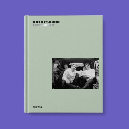
Visual Voices for Change is a journey into the many meanings of kindness.
EN


Looking Good EN
€ 38,00The book is available for pre-order and will ship from July 2026.
Looking Good is a compendium of Charles Traub’s photographs on the nature of wandering and the gaze itself, a central preoccupation of his art.
It brings together images from the mid-1970s to the present. As George Sand wrote, “the secret of the study of life lies in learning to use one’s eyes,” and Traub has pursued this study through more than fifty years of photography. People watch each other, watch Traub, stare into the void, wander in search of something to catch their attention. These are mostly candid photographs that capture the nuance of the fact that we are always in the act of observing.
What you discover, looking the way Traub does, is that in some sense we are all performers, aware or unaware, putting on different faces in the moment we are seen and see others. “The content is a glimpse of something, an encounter like a flash, it is enormously momentary.” (Willem de Kooning)
—
Photographs
Charles H. TraubText
Natasha A. ChukEditing
Yan JinBook design
Bunker21 × 28 cm
120 pages
Hardcover
EnglishIsbn 978-88-98030-94-1
Available from July 2026-
 € 24,00
Fantastic stories for real objects was born from the desire to tell the story of objects designed by the Castiglioni siblings, in particular Achille and Pier Giacomo, through an entirely original narrative lens.
Making room for the imagination, serious texts have been transformed into fantastic tales: genuine fairy tales conceived for adult-children. Behind every object lies a story, a dream, a two-way relationship with its creator.
Achille Castiglioni saw in “anonymous” objects a latent potential, collecting them and letting them mature in his mind until they became something new and extraordinarily real. This creative process, built on continuous research and reinterpretation, is told here through short stories that weave together moods, thoughts, and the design journey of those objects we now call “design classics.”
The stories, accompanied by illustrations, comics, and photographs, seek to capture the essence of the Castiglioni creative process, blending fantasy and reality with the freshness and irony that are intrinsic qualities of the family.
Each tale closes with a fact sheet that brings the reader back to the tangible reality of the object, completing a journey that begins in imagination and arrives at the real.
—
Texts by Carlo and Livia Castiglioni
Illustrations by Andrea Galanti
Afterword by Dario Scodeller
Book design Bunker16.5 × 23 cm
200 pages
Paperback with dust jacket
EnglishIsbn 978-88-98030-98-9
First edition May 2025 -
 € 35,00
Over 700 designers from more than 70 countries have reflected on what kindness means to them — toward themselves, others, humanity, and the planet — harnessing the strategic and persuasive power of good design to bring these reflections to life through more than 750 typographic artworks.
This 400+ page collection reveals how letters can transcend language and culture, communicating empathy, care, and respect across the world. Featuring original posters by notable contributors such as Joshua Davis, Samar Maakaroun, Kris Andrew Small, and interviews with Birgit Palma, Duy Nguyen, Mat Voyce, Pann Lim, Kinetic, Carina Lindmeier, Ibrahim Zaki, Vanessa Zúñiga Tinizaray, David Oku, along with a foreword by Steven Heller, the volume celebrates the creative, emotional, and social power of typography as a tool for positive change.
Produced through artworks in 34 scripts and languages, Visual Voices for Change demonstrates how design can break boundaries, spark dialogue, and unite communities around shared human values.
This publication represents the fourth annual edition of the global Fight for Kindness initiative — a movement that each year invites designers worldwide to explore empathy, inclusion, and human dignity, promoting a culture of kindness through typographic expression.To mark World Kindness Day, this edition has inspired exhibitions in 19 cities — from the United States to Malaysia, Bulgaria to Indonesia, Spain to Bangkok — forming a dynamic global showcase of today’s creative voices.
Completed with a typographic lookbook showcasing the fonts used throughout the project, Visual Voices for Change stands as both a powerful visual statement and an essential reference for designers, educators, students, and anyone passionate about the intersection of creativity and social impact.
Project by
TypeCampus & Zetafonts,
Debora Manetti and Shrishti VajpaiSponsor
Zetafonts FoundryCreative Direction
Shrishti VajpaiBook Design
Shrishti Vajpai,
Alina Vytiaz,
Sofia BandiniTexts by
Steven Heller, Debora Manetti,
Pann Lim, Duy Nguyen,
Birgit Palma, Ibrahim Zaki,
Mat Voyce, David Oku,
Vanessa Zúñiga TinizaraySize: 17.5 × 23 cm
Pages: 448
Binding: Paperback with flaps
Language: EnglishISBN: 978-88-98030-93-4
Available from: February 2026 -

Automotive Monogamy IT/EN
€ 35,00The search for subjects is done mainly in two ways: the author leaves small messages on every old car he sees around town; he also occasionally stops people driving these veterans. He also tells everyone he knows about the project, asking them to investigate in their families and, in turn, to spread the word among relatives and friends.
Then the meeting takes place, to immortalize the passage of time in this particular symbiosis, actually, between man and car: in the time lapse between ‘yesterday and today,’ in fact, the adventures and memories of an entire existence are interwoven.
Automotive Monogamy – aimed at lovers of photography and the human spirit – collects in these 96 pages and 70 photos the stories of the people behind each car, telling both visually – thanks to his shots collected in Italy, Argentina and the United Kingdom – and through the short texts that accompany them, their singular and often ‘epic’ stories.
Texts and photographs
Matteo FerrariTexts
Michele Lupi
Yorgo TloupasBook design
Bunker21 × 28 cm
96 pages
Hardback
Italian/EnglishIsbn 978-88-98030-92-7
First edition November 2025 -
 € 30,00
The artist has personally intervened on each cover, making every copy unique. The image shown here is purely indicative. Watch the video.
A visual and intimate journey through the pages of Francesca Biasetton’s notebooks—calligrapher, illustrator, and performance artist. The book is organized into several thematic sections—travel, ideas, nature, letters—and gathers years of work, notes, experiments, and graphic reflections born from daily observation and the continuous practice of drawing.
The cover itself is part of the work: each copy of the book is unique, with original hand-made interventions by the author directly on the press sheets during printing. The volume thus serves as a gateway into the fascinating experimental phase that precedes the finished work, providing a valuable tool for observing the method and imagination of a professional in drawing and lettering.
For Biasetton, notebooks go beyond a simple collection of drawings; they are instruments of investigation and storytelling. Her pages transform reality into visual alphabets. Subjects range from travel impressions to decorative patterns, from natural elements to free letter compositions. Browsing these notebooks offers an experience—gathering ideas, feeding one’s creative inquiry, contemplating the beauty of a precise mark, and honoring those pencils that can chart a path forward when everything seems still.
This book is an invitation to slow down, observe, and record thoughts and emotions, allowing a deeper understanding of oneself through paper. It offers a subtle glimpse into the personal universe of an author who guides us along this path of discovery and visual listening.
—
Notebooks by Francesca Biasetton
Texts by Luca Barcellona, Fabio De Luca
Book design Bunker21 × 28 cm
112 pages
Paperback with hand-illustrated cover
Italian/EnglishIsbn 978-88-98030-82-8
First edition October 2025 -
 -4% OffOriginal price was: € 83,00.€ 80,00Current price is: € 80,00.
The volume Alfabeti Modernisti Italiani collects over one hundred specimens of metal and wood movable type produced in Italy between the 1920s and 1940s, systematically organized into categories and subcategories: functional, cyclopean, triennial, synthetic, modulated, decorative, and modular. The book provides historical context, offering a clear mapping of the typefaces produced in Italy during this period.
Luca Lattuga’s research, realized in this volume, is an essential tool for exploring a little-studied phenomenon, shedding new light on a coherent and recurring style largely overlooked by traditional typographic historiography, emerging from small workshops and foundries, the so-called “basso.”
The significance of Lattuga’s work extends to contemporary practice: the digital foundry CAST has reinterpreted twenty-five of these typefaces, now available as digital fonts in the Alfabeti Modernisti Type Specimens collection, published by Lazy Dog alongside the volume, as explained in the introduction by Riccardo Olocco. In this way, Alfabeti Modernisti Italiani is not only studied historically but continues to influence contemporary typographic design, demonstrating the vitality and coherence of a cultural and aesthetic heritage often forgotten.
-
 € 20,00
Alfabeti Modernisti Type Specimens illustrates twenty-five digital revivals based on wooden and lead typefaces produced in Italy in the 1930s and 1940s, documenting a research and enhancement project that intertwines memory and design and gives new voice to a little-explored chapter of Italian graphic design.
Very popular at the time but now forgotten, the typefaces have been recovered by Luca Lattuga over a period of more than ten years. Reissued by the CAST type foundry, available for purchase at c-a-s-t.com and also available on Adobe Fonts, these geometric, sometimes vernacular, floral, highly expressive, often rationalist-inspired typefaces recount a crucial period in 20th-century Italian typography.
Their digital revival—the result of a selection from Lattuga’s complete collection published in the volume Alfabeti Modernisti Italiani to coincide with the release of this sample book—gives graphic designers and type designers full access to a unique and precious typographic heritage.
Typefaces
CASTBook Design
CAST23,5 × 28,5 cm
64 pages
Softcover with flaps
EnglishIsbn 9788898030910
Available from November 2025 -
 € 70,00
The first print run of 1,000 copies contains an eight-page insert, hand-set in lead type and printed by Editore Tallone on high-quality paper.
For at least a dozen years, Luca Lattuga has been collecting and cataloguing metal and wooden movable type produced in Italy between the 1920s and 1940s. During his research, he rediscovered a recurring and consistent style, hitherto little considered, that characterized that period. Although widespread at the time, this style, which originated in the printing workshops, remained in the shadows for decades.
These lesser-known typefaces coexisted alongside the famous types from historic foundries, such as Nebiolo and Reggiani, surviving thanks to their versatility and affordability and enjoying spontaneous and widespread popularity even in the most isolated provinces. They remained in use until the 1960s or 1970s, effectively lasting until the end of the era of movable type printing. They were widely used in advertising, flyers, posters, book covers, and magazine headlines. They followed European trends toward more modern forms and represented a fascinating vernacular expression, entirely Italian, of the international taste of the time.
The book contains over one hundred specimens, divided and grouped into categories and subcategories. It is accompanied by a testimony from the book’s editors, Veronica Bassini and Luca Lattuga, a historical analysis by Carlo Vinti, and a technical study by Luciano Perondi. The work is completed by in-depth profiles of some of the key figures of that era: Guido Modiano, Ruggero Zuliani, Francesco and Antonio Tocchio, and a gem by Enrico Tallone.
Texts
Veronica Bassini, Luca Lattuga
Luciano Perondi, Carlo VintiForeward
Riccardo OloccoBook Design
Luca Lattuga23,5 x 28,5 cm
336 pages
Hardcover
English/ItalianIsbn 978-88-98030-90-3
Available from November 2025 -
 € 33,00
How Many Women Are in the Room? is a symbolic question and an invitation to remain vigilant about female representation—both in design and beyond.
This volume documents the fifth edition of AWDA, Aiap Women in Design Award, the prestigious international biennial prize dedicated to women designers in visual communication. The title echoes the very question asked during the award ceremony, highlighting the need to carefully observe the roles, spaces, and languages that continue to be assigned or denied today.
How Many Women Are in the Room? gathers the selected and awarded projects, offering a broad and nuanced overview of innovative languages and approaches developed by students, professionals, and researchers. Visual projects by designers from around the world are accompanied by essays, focused studies, and interviews that explore themes linked to design and feminism: labor, rights, inequality, languages, and activism.
The volume is completed by essays from international activists, designers, scholars, and researchers who reflect—through visual design—on issues related to women’s labor, gender equity, and cultural and social disparities. It also features interviews with key figures from fields such as civil rights, communication, art, journalism, politics, and institutions.
The book is a co-edition project with AIAP, the Italian association for visual communication design, active since 1945 in promoting design culture and graphic professionalism.
Edited by
Cinzia Ferrara,
Laura Moretti,
Carla PalladinoTranslations by
Isobel ButtersBook Design
Costanza De Luca,
Lucia Tonelli
with the AWDA team16 × 24 cm
Paperback
336 pages
English / ItalianISBN 978-88-98030-84-2
First edition September 2025 -

Vida detenida IT/EN
€ 29,00Vida detenida brings together a series of photographs taken by Pedro Almodóvar in a domestic, intimate space, during moments of solitude and contemplation.
Away from the film set, Almodóvar shoots to perform a deeply pop gesture: transforming ordinary objects — glasses, flowers, plates, utensils — into small secular altars, charged with memory and desire. These are not simple still lifes, but still life as in ‘arrested life’: each object preserves vitality, responds to light, and changes over time.
These are photographs without post-production, where the focus lies in emotion rather than perfection. As Almodóvar himself writes: “What interests me is the ecstasy of the moment, staying alert and capturing the emotion of the instant.” This fragile, vibrant tension runs through every shot, where the beauty of the everyday becomes sacred, precarious, and never consoling.
Amidst painterly reminiscences — like the work by Isabel Quintanilla that inspires the first shot — and literary echoes — such as the verses by Wordsworth quoted by Simone Azzoni in the afterword — Vida detenida is a poetic journey through a daily life transformed into a postmodern ritual, where objects lose their primary function and become emotional enigmas.
A rare and precious book, where — as in his cinema — things reveal themselves by surprising us.
—
Photographs by Pedro Almodóvar
Texts by Pedro Almodóvar, Simone Azzoni
Book design Bunker15 × 24 cm
Leporello
24 pages
Italian/EnglishIsbn 978-88-98030-83-5
First edition September 2025 -

Building Bridges IT/EN
€ 23,00Building Bridges is Olimpia Zagnoli’s tribute to Gio Ponti—a volume conceived as an extension of the exhibition of the same name, inaugurated in early 2025 at the Italian Cultural Institute in Stockholm.
In this project, Zagnoli—one of the most influential illustrators and designers on the international scene—explores the encounter between her unmistakable style, marked by vibrant colors and soft forms, and the rational yet poetic aesthetic of Ponti, a pivotal figure in 20th-century Italian design.
The book features 32 previously unpublished illustrations that create a visual dialogue between the artist’s iconic female figures and the modernist architecture of the celebrated architect. It is also a deeply personal homage: Zagnoli lives in a building designed by Ponti himself.
The work stands as a refined celebration of mid-20th-century Milan, reimagined through the irony, lightness, and graphic sensitivity that define the artist’s unique perspective.
—
Illustrations by Olimpia Zagnoli
Texts by Giovanni Bellucci, Francesco Di Lella, Olimpia Zagnoli
Book design Bunker13.5 × 19 cm
80 pages
Hardcover
Italian/EnglishIsbn 978-88-98030-81-1
First edition April 2025 -
 Out of Stock€ 29,00
For purchases in the USA and Canada, we recommend contacting Oak Knoll.
Now More Than Ever: Typographic Posters on Kindness from Around the World is a publishing project that marks the third edition of the non-profit campaign Fight for Kindness. In 2024, this project expanded globally, with 12 exhibitions and digital showcases across eight countries: Italy, Spain, Austria, Hungary, Bulgaria, Egypt, the United States, and Indonesia.The publication collects works created in this context by both emerging talents and more established names, highlighting how the project has brought together a vast international community of creators, with over 450 works from 355 participants in 23 languages and writing systems.
The collection includes posters and messages from some of today’s most renowned and influential creatives, including Debbie Millman, host of the famous Design Matters podcast; Ariane Spanier; Héctor Ayuso, founder of Offf Barcelona and Paradiso Fest; Baugasm; Kiel DM, creator of the Space Type Generator project; Simone Massoni; Kinda Ghannoum; Hala Al Afsaa from the Syrian Design Archive; and the talented Ukrainian designer Kateryna Korolevtseva.
The book also features four exclusive interviews and a typographic lookbook showcasing the typefaces used throughout its pages. Typography has a unique power in communicating messages that inspire change. As both an art form and a tool, it transforms ideas into visual experiences. Now More Than Ever seeks to celebrate this potential, demonstrating how designers worldwide can use typographic creativity to promote kindness as a driving force for social change.
A project by
TypeCampus & Zetafonts
Debora Manetti, Shrishti VajpaiSponsored by
Zetafonts FoundryBook Design
Shrishti Vajpai17.5 × 23 cm
352 pages
Softcover with flaps
English978-88-98030-78-1
Available from February 2024 -
 Out of Stock
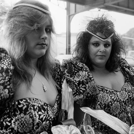
Limousine EN
€ 32,00For purchases in the USA and Canada, we recommend contacting Oak Knoll.
Kathy Shorr, raised in Brooklyn, bought her first car at the age of 17 and always loved driving. Her passion for cars dates back to her childhood, a time when only a few residents in her neighborhood owned a vehicle. As a young girl, she was inspired by her grandmother’s resourcefulness—the only member of the family to own and drive a car. Perhaps this early influence led Shorr to find work as a limousine driver after graduating college, turning the vehicle into a mobile photography studio.
For nine months, she captured a diverse range of passengers heading to weddings, proms, quinceañeras, and other celebrations. The limousine’s elegant interior served as a private space, allowing passengers from working-class backgrounds to embrace a temporary sense of celebrity.
Shorr’s work thus draws from two distinct genres in photographic history: the road trip — exemplified by projects like California Kiss by Elliott Erwitt — and studio portraiture. Just as families once visited a photographer’s studio to capture special occasions, her subjects stepped into the car in their finest attire to celebrate significant moments. In the 1980s, the limousine epitomized the ultimate symbol of luxury and social status. Long, sleek, and often featuring opulent interiors, it represented economic success and access to an exclusive world.
As Chris Lezotte notes, although women were often stereotyped as too frail to handle the “motorized beast,” they have long defied these gender norms, reclaiming the automobile as a source of autonomy. Shorr’s grandmother primarily used her Chevy for family outings, but it also stood as a means of independence. Kathy, on the other hand, as both photographer and driver, relied on the car to offer herself and her passengers the journey of a lifetime.
Photographs by Kathy Shorr
Texts by Chris Lezotte, Jean Dykstra
Book Design by Bunker21 × 26 cm
96 pages
Hardcover
EnglishISBN 978-88-98030-76-7
First edition, November 2024 -
 Out of Stock
Rêves Entrelacés EN/FR
€ 22,50The book is available only on our website or at festival venues.
Born in 1990, Amir Zand is a highly talented Iranian digital artist known for his multidisciplinary approach and unique perspective on visual art, conceptual design, and illustration. Over the past ten years, he has distinguished himself internationally, particularly in the realms of science fiction and fantasy, thanks to his visionary creativity and works characterized by a rich and unmistakable style.
Zand’s career is already filled with prestigious projects, having designed over sixty book covers and collaborated on iconic sagas such as Star Wars, Warhammer 40k, DUNE, Halo, and Mortal Engines. His work has been included in three consecutive editions of SPECTRUM: The Best in Fantastic Contemporary Art, one of the most important artistic publications dedicated to the fantasy genre. In 2020, he was listed among the 100 most esteemed illustrators in the world by the Association of Illustrators of Japan. His creations have been exhibited in prestigious museums and galleries, such as the Museo della Permanente in Milan, the CAFA Art Museum in Beijing, and the Shibuya Modi Gallery in Tokyo.
The book Rêves Entrelacés is conceived as a catalog for the artist’s solo eponymous exhibition, held during the Festival International du Film de La Roche-sur-Yon in 2024, marking his first major presence in France. The collection of illustrations provides a comprehensive overview of Zand’s work, compiling all the illustrations from the exhibition and featuring an exclusive interview with the artist conducted by Melania Gazzotti and Charlotte Perriand.
Illustrations by Amir Zand
Texts by Amir Zand, Maximilien Schel, Charlotte Serrand
Translations by Mercedes Claire Gillom, Cloé Tralci
Curated by Melania Gazzotti, Charlotte Serrand
Book Design by Bunker19.5 × 26 cm
64 pages
Paperback
French/English
Isbn 978-88-98030-72-9
First edition October 2024 -
 € 36,00
For purchases in the USA and Canada, we recommend contacting Oak Knoll.
This book is about the roman type used in Venice by Nicolas Jenson, one of the most successful 15th-century printers. Jenson was well-known among his contemporaries because of his success as a printer/publisher and because of the quality of his type.
His editions featured several rotundas, and notably, a roman which can safely be considered as the prototype of virtually all roman types up to the present. Jenson’s roman has been highly praised in the past and was used as a model for several type revivals by early 20th-century private-press printers. However, the importance of this type in the development of our typographic letters has not yet been sufficiently recognised.
The volume aims to draw attention to this important type and to its maker with fresh bibliographical information and photographic analysis of the letterforms. The type is thoroughly analysed, the career of Jenson is sketched, and discussions on type-making techniques and the origin and development of its letterforms are presented.
Finally the influence of Jenson’s design is illustrated. This will show how his specific design choices were picked up by such punchcutters as Francesco Griffo and Claude Garamont, and became the standard for roman lowercase up to our times.
Images will play a pivotal role in this richly illustrated book. These visualisations allow readers the opportunity to explore the data and examine both the broader context and finer details, and systematically follow the discussion while verifying the reliability of the analysis results.
Text, photographs and book design by Riccardo Olocco
Preface by Lotte Hellinga21 × 28 cm
120 pages
Hardcover
English
Isbn 978-88-98030-68-2
First edition October 2024 -

Do the Write Thing IT/EN
€ 49,00For purchases in the USA and Canada, we recommend contacting Oak Knoll.
Do the Write Thing, Luca Barcellona’s second monograph, represents the ‘travelogue’ of a multifaceted artist who has been moving in the world of letters for nearly two decades. Ten years after the bestseller Take your pleasure seriously, Barcelona gives new suggestions through a large selection of new works – commissioned or personal projects – with which he recounts the maturation of his own taste and creative approach.From more traditional calligraphy works to large-format works, through graphic design, illustration, engraving, and typography, and on to recent experiments with lettering through VR. Hundreds of calligraphic artwork and lettering for packaging, record covers, labels, murals and logos, as well as live performances with musicians and athletes. The book traces Barcelona’s journey through images and stories collected in the experience of the lettering world; a true school of life, starting from aesthetics to the spiritual path, what navigated calligraphers know as ‘the way of writing.
This is a more introspective book than its predecessor, reflecting at bottom the practice no longer of a calligrapher but of an artist using calligraphy. In addition to an authoritative and knowledgeable opinion on the state of the art of this discipline, corroborated by contributions from practitioners and colleagues of Barcellona, the book gives a new and fulfilling visual experience. Its 344 pages bring together more than 500 images in an elegant volume, aimed at calligraphers and calligraphy enthusiasts, designers, communication professionals, teachers and students.
—
Text and calligraphy by Luca Barcellona
Contributors: by Maria Eugenia Roballos,
Francesca Biasetton, Christopher Haanes,
Carl Rohrs, Ewan Clayton, Thomas Ingmire,
Brody Neuenschwander
Book design by Bunker22 × 30 cm
344 pages
Hardcover with colored edges
Italian/EnglishIsbn 978-88-98030-25-5
First edition November 2024